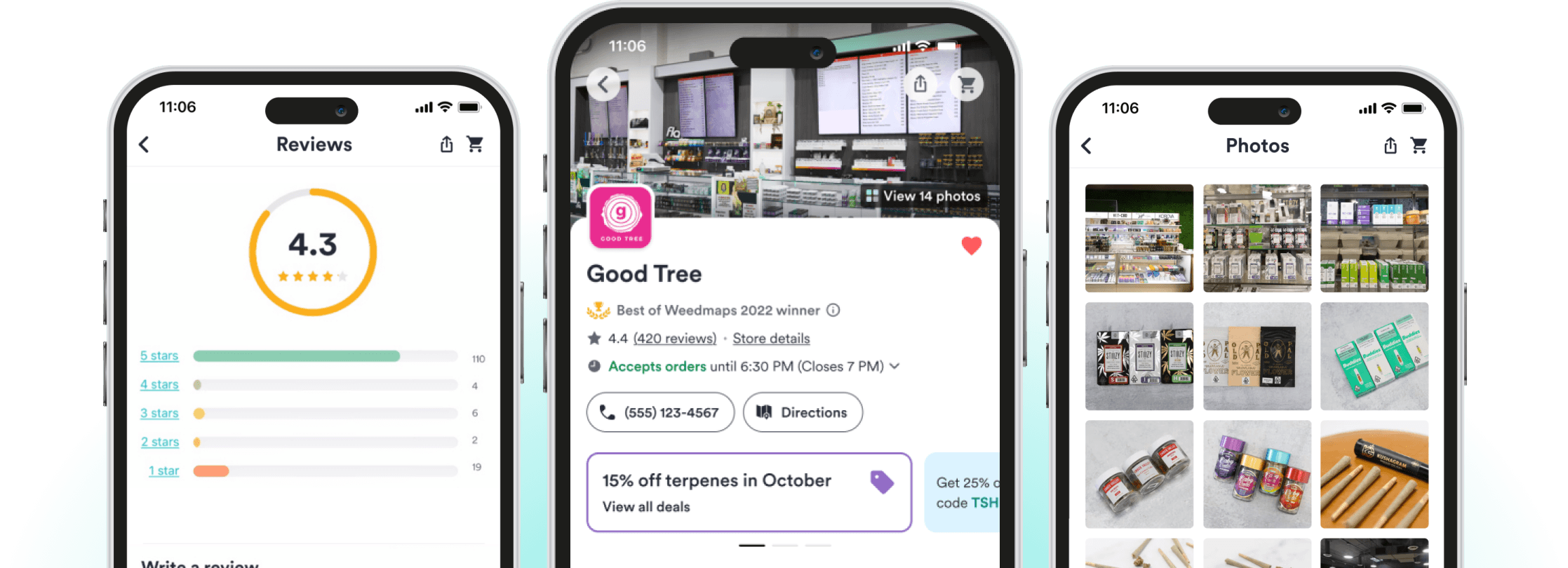
My Role
I spearheaded the redesign of Weedmaps' B2C retail storefront as the lead product designer. Leveraging user research, I pinpointed critical issues in the existing design and actively iterated on a design solution to tackle them head-on.
Problem Statement
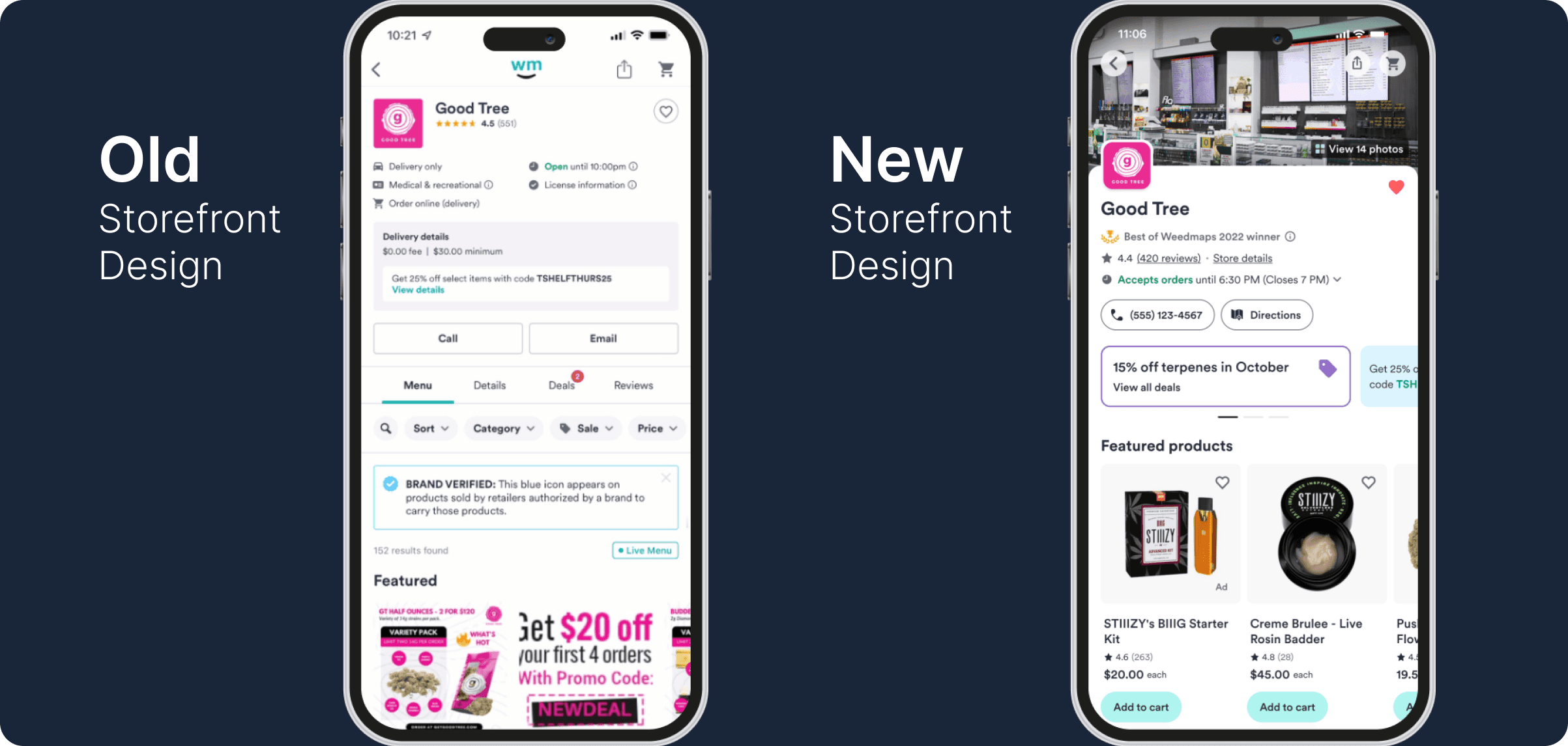
Qualitative research highlighted design issues affecting both consumers and retailers
In addition to performing my own heuristic evaluation of the current design, I actively sought feedback from both consumers and retailers. The insights gained from their perspectives were illuminating:
Problems for Consumers
Cluttered UI that was difficult to parse
Small font size for content
Dated visual design
Missed tabs containing deals and other content
Lack of information on ordering cutoff times
Problems for Retailers
Retailer deals were overlooked within tabs
No way for retailers to showcase their physical stores
Goals
Improve content hierarchy for Deals, Featured Products, and Menus
Simplify information architecture by removing tabs and logically grouping content
Approach
Principles, strategies, and techniques
Effective collaboration: I actively engaged with stakeholders, fostering teamwork
Design approach:
Conducted heuristic evaluation
Validated designs with consumers and retailers throughout project
Embraced user-centered design thinking
Created high-fidelity prototypes for testing
Prioritized accessibility
Developed detailed documentation for developers
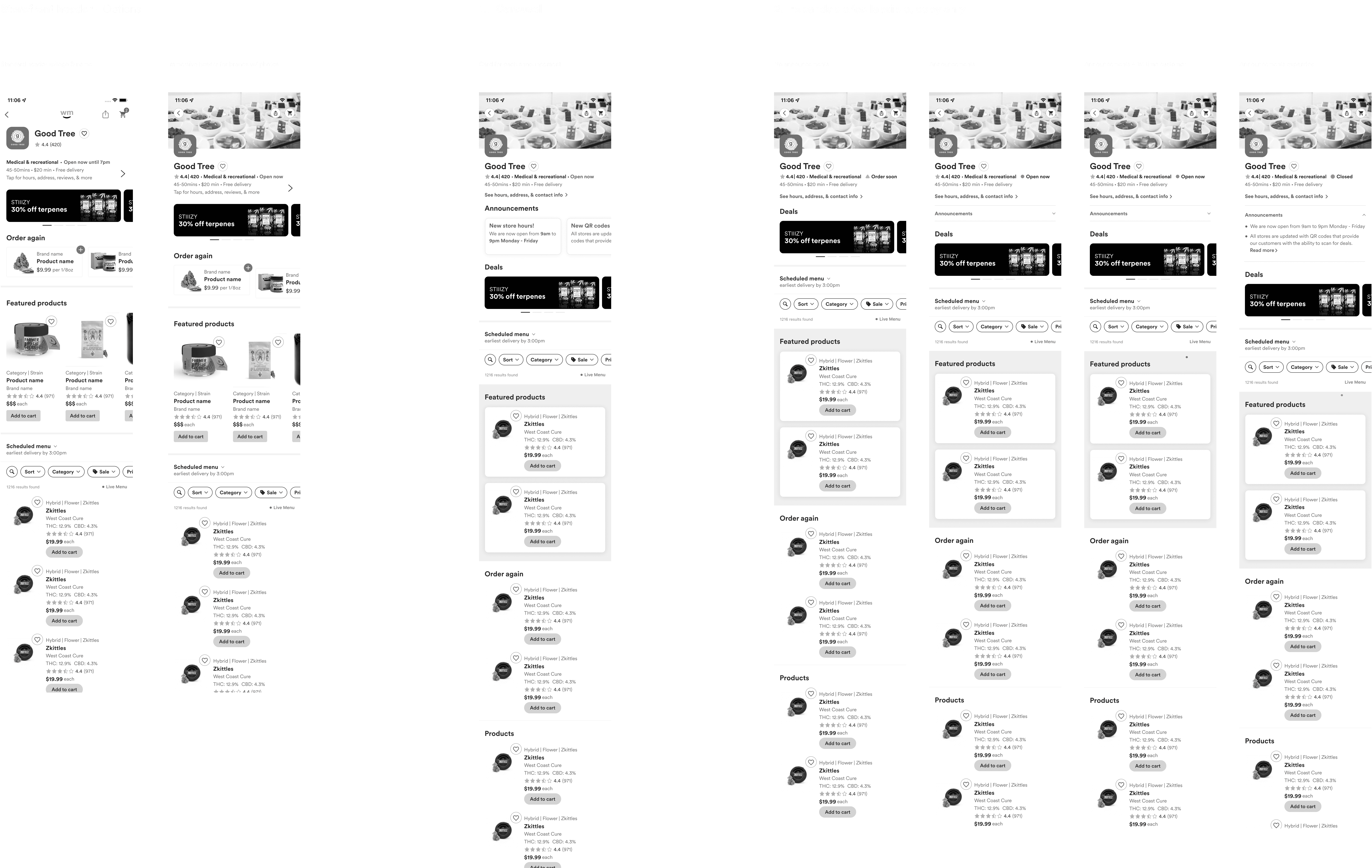

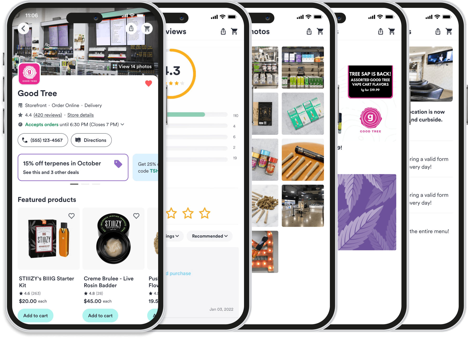
A revised information architecture for improved discoverability
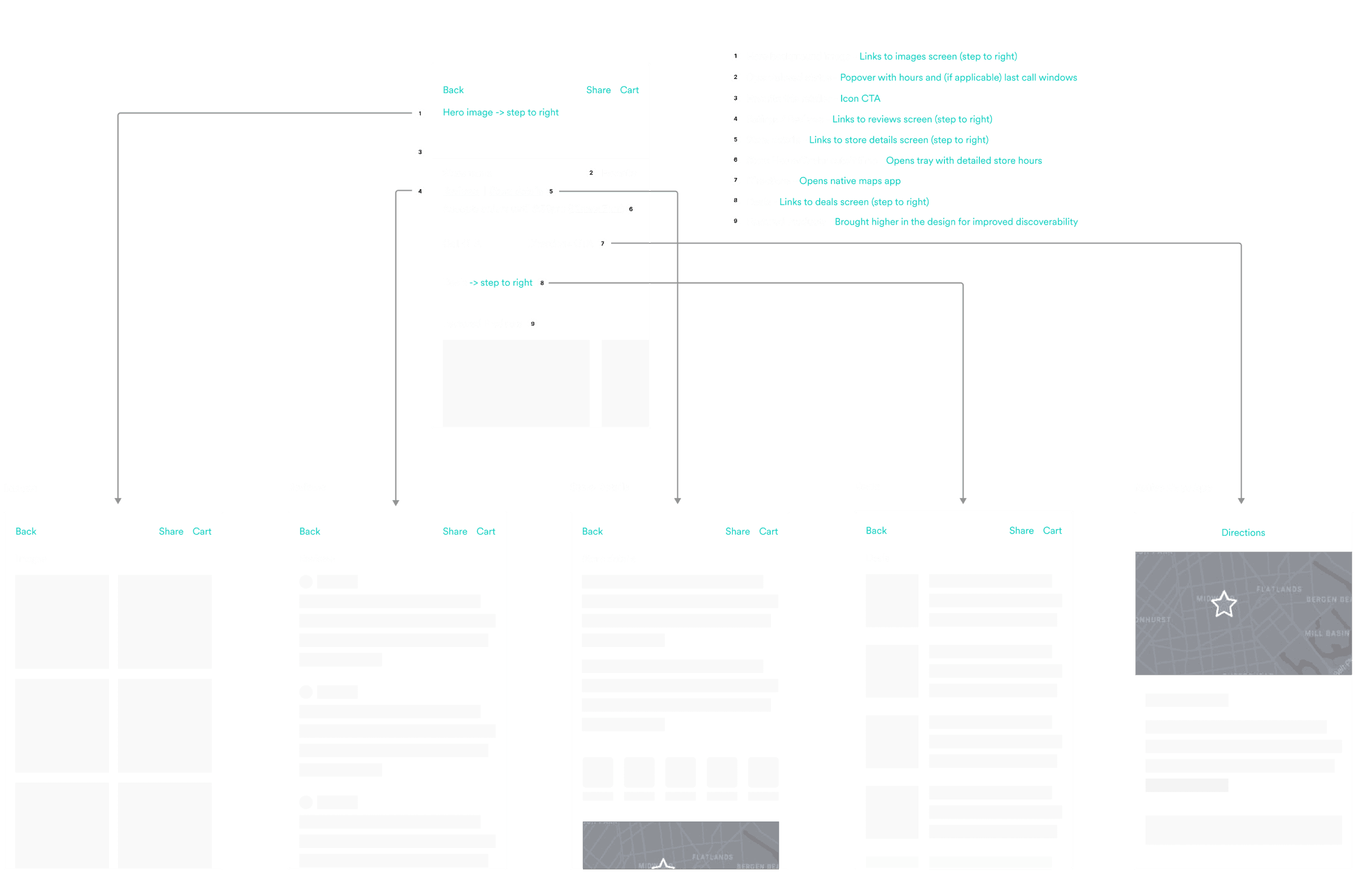
By utilizing a more defined hub and spoke IA, the storefront and menu take priority. Other content such as store details, reviews and promotions benefit from improved discoverability.

An opportunity for retailers, and valuable store context for consumers
During research, consumers voiced the desire to see more about the physical store of retailers ("Does the store look well-kept and reputable? Is it a place I would feel comfortable visiting?"). Photography provided by the retailer give additional detail about their store to consumers.
Outcome and conclusion
Metrics and insights gained
Following the launch, the revamped storefront achieved an impressive 15% increase in consumer engagement. This success can be attributed to several key factors:
Heuristic evaluation: I identified critical areas for enhancement by conducting a heuristic evaluation.
User and stakeholder feedback: I actively sought feedback from both consumers and retailers regarding the existing design. The insights shaped my approach to the user experience.
Iterative approach: Regular validation with users, retailers, and leadership ensured that the final product aligned with user needs and business goals.
Conclusion
In summary, prioritizing the user experience ensures that design decisions remain aligned with user needs and preferences. For this project, it resulted in tangible benefits for consumers, retailers and Weedmaps.

